

In what is becoming a bit of a quadrennial tradition, it's time for a wholesale site update. GoKunming last got a facelift in 2010, and before that in 2006. As with last time, the changes are pretty big.
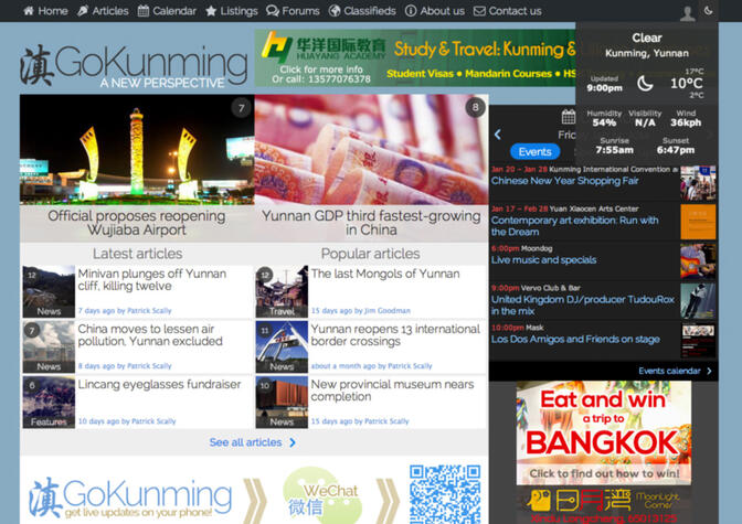
The most noticeable difference is the site's overall appearance, which is more modern and easier on the eyes. We also have reverted to the use of an updated version of our 2006 logo. There is no better symbol to represent Yunnan and its capital city than the character dian (滇).
In addition to a brighter color scheme and new logo, we have introduced several functions that make GoKunming more functional and user-friendly. Some of the updates are coding changes that make the site faster, more secure and more responsive. Others are more obvious and include the shifting of the sidebar from the left to the right side as well as the use of tabs and icons throughout the site.
Here is a brief description of the changes we are most excited about, including modifications to some sections that are in development and will be available soon.
Responsive design
The GoKunming you see on your mobile phone and on your desktop computer are no longer two separate websites. By utilizing responsive design, the page layout automatically adapts itself to the screen of the device you are using, changing size to accommodate your specific needs.
Accessing GoKunming should now feel native to the most common and popular mobile devices. There are four layouts, the largest of which is 33 percent wider than our previous design. Resizing down one step makes the page roughly the same size as our old appearance. One dimension below that fits tablets such as iPads perfectly. The smallest size is a fluid design adaptive to the compact screen sizes common to all smartphones.
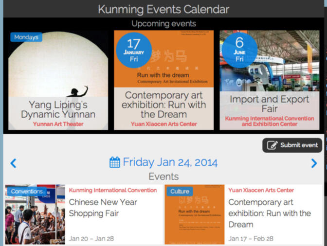
Events calendar
In an effort to make the Calendar more useful, we have added three tabs labeled Events, Specials and Upcoming. The Events section will continue to announce when bands and DJs are playing, what cultural activities are being held in Kunming and when the next quiz night will be held. The Specials tab lists food and drink deals going on at local establishments while announcements listed under Upcoming give a sneak peak at what premium events are happening in the near future.
Each event in the Calendar now has a dedicated page, featuring posters, longer, more detailed descriptions and a map. They are also categorized, can span multiple days and have separate fields for starting times and pricing. Registered GoKunming users can submit items for the Calendar, which will be reviewed by the Moderator and then added to the site.
Search function
Our search function performs much better than it has been in the past and there are now dedicated search functions for different sections of the site. These include search bars for our 1,900-item Article archive, the Forums and Classifieds pages and our extensive business and venue Listings.

Classifieds
The Classifieds are now more user-friendly and navigable. Icons have been added representing specific categories. When scanning through the Classifieds it is now easier to find what you are looking for, as only a short summary is visible.
Departed elements
Gone are the tag cloud and the photo gallery. The cloud has said its last goodbye, but the gallery will make a triumphant return this summer and then be updated regularly with images taken by both amateur and professional photographers.
It is our goal to establish a collection of photos documenting people from all 25 minorities living in Yunnan as well as a database of images of the most breathtaking and iconic natural vistas the province has to offer.
Miscellaneous
The menu bar at the top of the page stays put, giving you navigational options no matter where you are on the website. Added to that is an extensive user menu which, when you are logged in, includes your inbox, dashboard and public profile. Beside this feature is a weather report chock full of meteorological info.
The From the Web section has changed its name to News Wire and migrated to the middle of the homepage, where it fits quite nicely below our Articles.
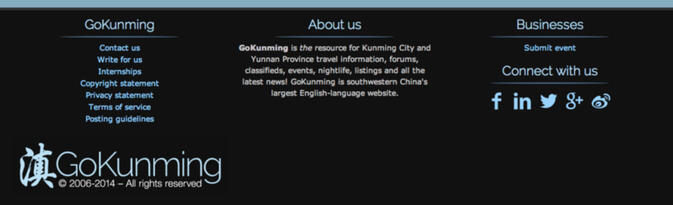
We added a footer at the bottom of every page with useful links explaining who we are and how to use the site. It also contains sharing buttons for social media as well as copyright information and other useful links.

Promotional spaces
We have increased the size of our sponsor ads and shifted sidebar ads to the righthand side of the page. A new, non-rotational space has been introduced on the homepage, directly below the News Wire, for short effective marketing campaigns.
If you are interested in promoting your business or event to our rapidly expanding audience, feel free to get in touch via the contact form.
Coming soon...
Due to popular demand we will be installing up/down voting for user comments throughout the site as well as a report spam button. Threaded forums and comments are also in the works, meaning you will soon be able to add a remark to a specific user post.
The Listings and Events sections will also be updated again. Business owners will be able to manage their own pages and Events are going to have comments, a gallery and an RSVP function. A homepage Listings section is also in the works. It will show the latest reviews and additions, as well as the top-rated venues in many categories.
If you have other feature requests or general remarks, please leave them in the comments section below. If you come across any bugs or broken links please get in touch with us via the contact form.


Comments
Patrick, well done. I know how much work goes into designing a new site and transitioning all of the content. It looks great. Thanks for continuing to build on this useful and informative site. For those of us who have some roots in Kunming but don't get back there often enough, goKunming is a great way to stay informed. Again, congratulations on a job well done!
First reaction: Damn it looks good!
Then after a few minutes of clicking this and that the second reaction: It works!
I only have one complaint. I know it is the latest style but the grey font text is a pain to read. Maybe, because of my old and failing eyes, I find reading websites employing the subdued fonts a bit difficult to read.
Good job!
Where's the SPAM button? You forgot?
Great new look; I think we should attribute this work to Yereth more than to Patrick. Only one question: is site-wide search planned?
Great changes.
Thanks to the GoK team, all.
Great changes.
Thanks to the GoK team, all.
I will also echo @Geezer, the grey font is hard to read, and a bit small for comfort if I was to read for a long time.
Looking sharp. Nice job!
Thanks for all the kind words. And bluppfisk is correct, kudos should go to largely to Yereth, who doubles as GK's tech guru.
Those of you who mentioned the gray font, are you viewing the site on a windows machine? We'll look into making the text darker.
Liumingke1234, the spam button is on its way. Check the 'Coming Soon' heading above.
Thanks again everyone!
@Geezer, tigertiger: The font is now slightly darker. I hope it helps. :)
Feel free to let us know if there's any other problems or if you have any feature requests.
We hope you all enjoy using the new GoKunming!
Nice look, but not too enthusiastic about the light blue background. Makes the screen way too bright and text a little more difficult to read.
Just FYI if you hold down the Ctrl button and spin the wheel on your mouse you can change the font size,,this works in Chrome, not sure if its the same for IE
Way too much scrolling on mobile devices (E.g. iPhone)
On the phone it seems there are more banners than actual information.
3 tabs for events means I have to click 3 times to find out what's going on? Is this hassle necessary?
It would be great if you changed the design in a way that it becomes more efficient on mobile phones.
Thank you. :-)
Good job on the site. Hope this site brings in more people looking for good resources. Congrats on your improvements.
@Markus: We tried to find a balance between desktop and mobile, as one does with responsive designs. The previous mobile website was lacking behind the desktop site because it was a separate website and therefore development.
Less scrolling on the mobile site, without hurting the desktop version, could mean the implementation of more tabs, but if you don't like the use of tabs, perhaps you have other suggestions or can submit design examples?
Thanks!
@ Yereth: Operating system or browser junction.
Reduce the size/get rid of banners if mobile operating system.
I could send you lots of examples for website that are especially designed for mobile devices.
I think there is a trend towards having 2 sites: desktop/mobile.
The art is probably to code a script that modifies the desktop site to be a decent mobile site.
It's perfectly all right that you don't want to do that. The consequence might be that your mobile site is not that good.
That's it.
Nice one, new site looks good and is whaboom, fast! Couple of teething problems:
The Calendar bar at the top of pages isn't horizontally aligned with the page content, leaving a chunk of blue space. That looks a bit naff and makes the site look unprofessional. Not sure if this is intentional or not, but I would change it!
The comment box can be expanded but only vertically, it should be able to be expanded horizontally too or at least stretch to the right side of the articlebody section. I guess you are trying to stop people from writing narratives? It will probably happen anyway...
@ Yereth
It is a bit better, thanks.
@Yereth
Looking at GoK on my android tablet. Looks very good and everything seems to work. Font is a crisp black, nice.
Actually looks very good on my 10.1" screen.
@Blobbles: It's intentional. Aligning the top of the sidebar and main contact area has it's own aesthetic problems. I'll have a look at the comment box. Thanks for your feedback.
@Geezer: Glad to know it looks good on the tablet. Hope the font is clearly readable now. Making the font-size larger didn't work, in my opinion.
Generally, mobile platforms will have better font rendering, because of the higher screen resolution. Macbook retina screens look quite incredible as well.
Cool! Great job! It works very well on my mobile phone, pad, and also computer.
I like this new design a lot!
Not impressed with new site. Much harder to read and navigate. Hate colors.
I'm finding it hard to navigate around too - looks cluttered, so much scrolling to do and the text keeps jumping around. Maybe I'll get used to it.
I was hoping that the search function much improved, but was disappointed to find that it still doesn't list results in date order (or am I missing something?). So entries made months ago come nearer the top than recent ones.
Why is the left column higher than the right column??
I like the logo, the icons and the permanent menu at the top. And the weather button top-right is neat. Can you add "pollution levels"?
Ocean: I hope 'navigating around' is mostly related to getting used to the new look and feel. Time will tell. We'll keep working on improving the site.
About the search function: It currently sorts by relevance, which means entries that fit your search query the best will be in top. We'll add different sort options as well later. The problem with sorting results by date is that they are not necessarily relevant (the search term could for instance be mentioned only once in whatever content you're searching) and only show in top because they are recent.
We're trying to find a open API for pollution levels, but the websites we know of don't offer the information unless you include heavily styled (and not necessarily well integrating) widgets.
A couple of things I noticed navigating.
1. In the comments section, I see oldest first, this requires me to click on the latest page number, another action required by the reader.
Can it be set to newest at top? Is this just my browser settings?
2. When I click to look at classifieds, I get a list of cropped ads. I need to click on each one to see full text. and then click to go back. Before I was able to scroll through all the complete ads, which was much easier and faster, even if I was scrolling past some ads. For me the ads are now less user friendly. I used to just skim though them, and occasionally I would make an impulse buy. Now, this is less likely.
Correction.
1. In the forums section.
I also found the site hard to navigate since the new look, but didn't know why- now I kmow, everything is too close together! Any chance of putting some air between the columns?
Also, note while I am writing this comment on my ipad, the menu bar is blocking the comment box...
@Tigertiger: I'll add a link to a thread's latest forum post in the thread lists. Most forums show the oldest post first so that the link/url to that post will always stay the same.
The classified ads in the overview are 'cropped' to make it easier to scan through ads. It ensures that if there's a particularly long classified in the list that doesn't interest you, you don't have to scroll through the entire text to get to the next post. It gives each ad an equal chance of being seen, disregarding the size of the post.
@Yereth, I can see the logic of what you are doing. However, there are only very few very long ads, and I often still want to scan/skim these, which I cannot do.
Overall I am no just not doing this as click and wait is not my style.
I may be alone but I don't think so.
All looks good.. Have always thought that the calendar would be well served by an "add this event" or "subscribe" button that would allow users to add events to their personal calendars with a click or subscribe to events at their favourite venues.
While I am on the topic of calendars, a schedule of minority festivals around the province would be awesome too.
Body font colour on Apple devices appears darker than on Android and Windows ones.
One thing that is missing - the latest reviews from the side menu! I thought that was a good touch as it would alert me to any new places which I haven't been to before...
Maybe you should have a search in the top bar as well? With a drop down to select what you want to search? Just that search is also missing off the front page.
Regarding the search, you may want to have it not just by the individual key word entries, but also by the total string and possibly by the individual combinations. So if I search for "best VPN in China" I would get results for "best VPN in China" first. Then you look at splitting the phrase into 2/3 (e.g. "best VPN" and "in China") then you can remove the common words (in/at/the etc) and do a relevance search. Its much more resource intensive for the DB but will provide more accurate results. Depending on what system you use Full Text Indexing with Natural Language interpretation including stop lists should be possible as well (Database geek here!).
And finally, which is better?
i1269.photobucket.com/[...]
i1269.photobucket.com/[...]
Blobbles: Thank you for your constructive criticism. The listings will be back new and improved in the form of a homepage box later. We're also working on exactly the kind of search function in the top you are suggesting.
Regarding the search mechanism: We're partly performing searches as you're suggesting – ie combining full text searches with matching literal phrases (especially for titles). This means that if your search phase exists in the title of any entry it will be the top result. Breaking things down as you describe is definitely something to consider, but I tried to keep a reasonable balance between performance and relevance. I'm sure there's more optimisations to be made.
Regarding your sidebar design suggestion, I believe we're on the same page. We're working on a series of improvements and it may make it to the next update. Initially I was inspired by the usatoday.com website regarding sidebar design, but finally we decided to remove all shadows (flat design), which makes the sidebar look a bit 'off' to some.
Didn't you say that avatars were added to profiles now as been looking to see and couldn't find.
i like most of the new site. good job!
a few issues:
the search function is harder to find but the tags are more user friendly. i look forward to the new search priority function (sort by date/relevance).
search terms need to be re-entered if you change the section to be searched (via the All/News/Features/Travel tabs).
could you add a function where the small images in the article can be expanded maybe by clicking on them (like Facebook)? is the gallery still here? i haven't checked.
i like the way that the forums on Kickass Torrents puts the OP's post first and the newest posts appear below it. strikes the balance i think.
I'm still striuggling with the need to scroll so often and so far on the new site. And the search function is still very frustrating. I searched for "raising a baby in Kunming" in the "living in Kunming" forum and was shown (in order)...
Child Support Advice,
Gay Life,
Air Quality,
Kunming taxis,
Expat Population,
Kunming sucks, and
Salsa Dancing,
...before finally finding "Having a baby in Kunming"
Something is amiss!!
A global search function is coming soon.
@debaser: The search disappearing when changing sections is related to our top-down approach of how information is ordered. Does it feel unintuitive?
We are considering different views for the article section, with an option to see larger images. I'm not entirely sure what you mean by how Kickass Torrents arranges their forums. Could you elaborate?
@redjon77: Avatars will follow later as well.
@Ocean: We feel generally the search function is delivering more relevant results now. We'll keep testing and improving it though. Forums are tougher, because sometime threads may come up in top due to posts within the thread getting 'high scores' on your particular search query.
@Yereth - KAT place the original post on the top of every page of the forum post and the latest posts below (even if there have been a number of pages and/or a long time between them). anyway... just an idea. i'll send you a screenshot via the contact form as i can't see how i can add it here.
Visit GK website significantly less now than before the refresh. GK is an immensely useful site but it's not compelling in the same way as online banking, subscription newspaper website and the BBC iPlayer. The latter I'd overcome any usability issues to get to the content. GK appears faster, but that doesn't make up for the UI which has taken a backward step. Accessing via an iPad: the pages no longer resize and previously I could double tap and instantly get one column to occupy the entire screen - no longer. Blue lettering on a black background adds to the difficulty on a small screen. Icons to 'identify' content take up significant screen real estate but are of little value and my guess is that most users will totally ignore them. Having allowed time to get used to it, overall, and bearing in mind the amount of work involved, it looks a mess. A cleaner, less cluttered site would be my preference since it would better fascilitate frequent quick visits. Currently, it's too much like hard work, particularly if the ISP is having a bad day. Finally, trying to proof read and edit this post in a box not much larger than the size of my thumb does not constitute an improvement.
Where's the search button? I can't find it.
Powers that be already said they're working on a global search function. In the meantime, a good trick that works for any website: in Google type "site:gokunming.com whatever you're looking for", e.g. site:gokunming.com haiyuan temple
This will search only GoKunming for the terms that you use. As mentioned, works on any website and usually works better than a given site's built-in search function.
There are search fields in the listings, forums and classifieds sections. Under each content header.
I'm sorry but I don't find any improvement with the new format - I don't mean it's any worse, just that this kind of shifting of things around is more trouble than it's worth, both for the website folks & for the users. Add concrete content, okay; but don't bother with the appearances thing.
Ok, new look is growing on me (like a fungus?) - but that's a good thing (minus the fungus). I especially like the weather icon next to the "you're logged on" icon. Nice touch!
So, after a few weeks of trying to get over the shock of the site looking so different, I have to say I still am loathe to come onto GoKunming with the new look. Don't get me wrong, there are great improvements and the site design has some pluses... however, it is not a site design that works with large multicolored advertisements running everywhere. The dark background of the older site made these seem less garish, but the new light color gradually just means that all I see is the ads.
As a second (related) note, this site does look nice on touch devices, but the lack of framing (like the old site had) can make going through the forums or classifieds an irritating experience.
best of luck in the growing pains.
The new GoKunming is a disorganised mess. Maybe it's because I'm not viewing it on a 52" monitor at 3192x2048, or maybe it's because I'm not using a touch device. I'm sure there must be improvements in here somewhere, but I'm not benefiting from them at all. This new site is different for sure, but certainly not better.
I want to know if this website would provide the function of "user searching", how to search user's former posts or comments by searching a user name.
Thanks
I would like the classifieds to have same functions as the forums. I like the All feature. Would appreciate one for the classifieds.
Another error I still get - when loading the mobile site, it seems like the fonts take an age to load. Not sure why but it sits around trying to load all the time.
Also the listings (while still there) haven't been sorted out yet. Not sure if your advertisers will be happy about it, I certainly wouldn't be! I would advise at least having the latest reviews and listings appear (i.e. in reverse chronological order) when the city is opened, defaulting to Kunming, as an interim measure. Previously they were a great way to find out about new places, now they pretty much don't exist and are near enough to invisible on the site.
And I get what you said about the side bar after visiting USA today. The difference with USA today of course is that it is a shadowed main column which provides (when combined with the non aligned sidebar) a sense of the main column appearing to float over the side bar. As you have a flat main column though it seems that the columns are just misaligned.
Fonts now taking a long time to load again on the mobile site. Won't report this error again, will just visit the site less.
I hate almost all website layout overhauls at first, so I give myself time to adjust. But the new GoKunming layout has not grown on me. There's too much scrolling involved when using a laptop. It's difficult to find the search bar because most pages don't contain it. Overall, the compact, functional layout we had before was quite nice and didn't need to be changed.
I totally agree with @paulb. I've tried to be patient and get used to it too, but all the scrolling and the difficulty in searching is a hassle.
New website design should have been an improvement over old, but really miss old one. Why no edit button when posting in forum?
I also miss the latest reviews that used to show in the side bar. It always alerted me to good (or bad) places.
edit button and delete button = 没有
Yeah, mPRin said. I no longer even look at reviews so don't bother checking out new places.
Also, It would be nice to be able to comment on or review individual event listings.
I like viewing the site on my tablet. It is much better than on my laptop. So much so, I just use my tablet for goK now. That used to be reversed. If you're frustrated by goK on computer and have a tablet, give it a try.
A link to the desktop version when viewing on mobile devices would be handy, as it's currently not possible to zoom in/out on phone and tablet.
Seven months since the new website, I wonder what folk think about it now?
I'm still surprised there's no Search option on the Home page. and the search results are still very random. I wish there were more than 5 Forum titles shown up front, even if it meant less Comments titles or something. Otherwise, I've got used to it more than at first.
Still no spam button or 'report' button. Still getting the same 'love potion/spells' spam.
And the major chunk missing - the new reviews and listings section still isn't online, apparently its been in testing since March??
This is Kunming, so shao deng. Hai you shi fen zhong.
ma shang
Login to comment